
20 new CSS Viewport units are here. Including 'svh', 'lvh', 'dvh',
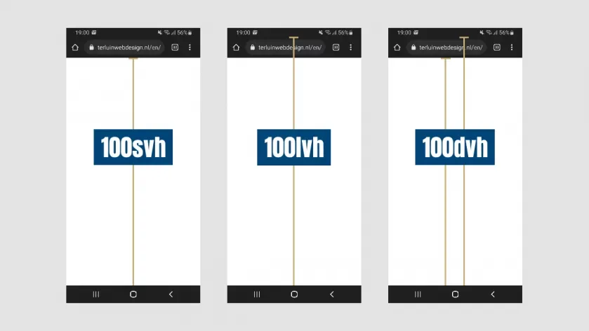
As a frontend developer, I have been pained so many times by trying to support mobile when the design has a full height. Hours and hours have been wasted trying to take into account the fact that when you scroll on your mobile device. The device will start to remove or show toolbars that mess up the design.
Recently while listening to my favorite developer podcast Syntax. I learned that there are finally some new units coming our way that are almost fully supported by all browsers. You can listen to that podcast by clicking below.


In response I was going to do some research into them and write up a long post about each of the new units but I found this amazing blog post linked below that you should go and read instead.

I really can not wait to start using these in production and cant wait to see what crazy and inventive ways people will use them.